Gràcies Barna
While roped by the beautiful modernist lines that braid through Barcelona, I fell in love. Vermouth had always been an ingredient I begrudgingly bought whenever I made cocktails. But in Barcelona, I tried and understood the spirit of this humble fortified wine.
As sensible and artistic as this drink may present itself I believe it deserves more. It shouldn't be restrained next to more delicate spirits. It shouldn't hide its boldness. It should stand tall. Proud of its edges and its strength. It should make noise. Belch away. Be unapologetically itself. A borderline nuisance.
Uncouth, if you may.
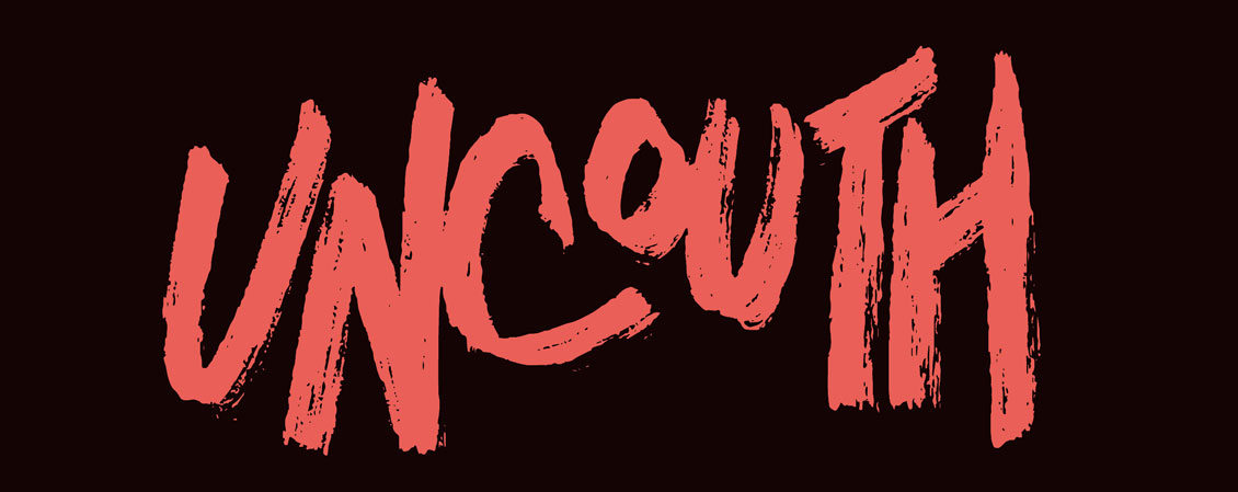
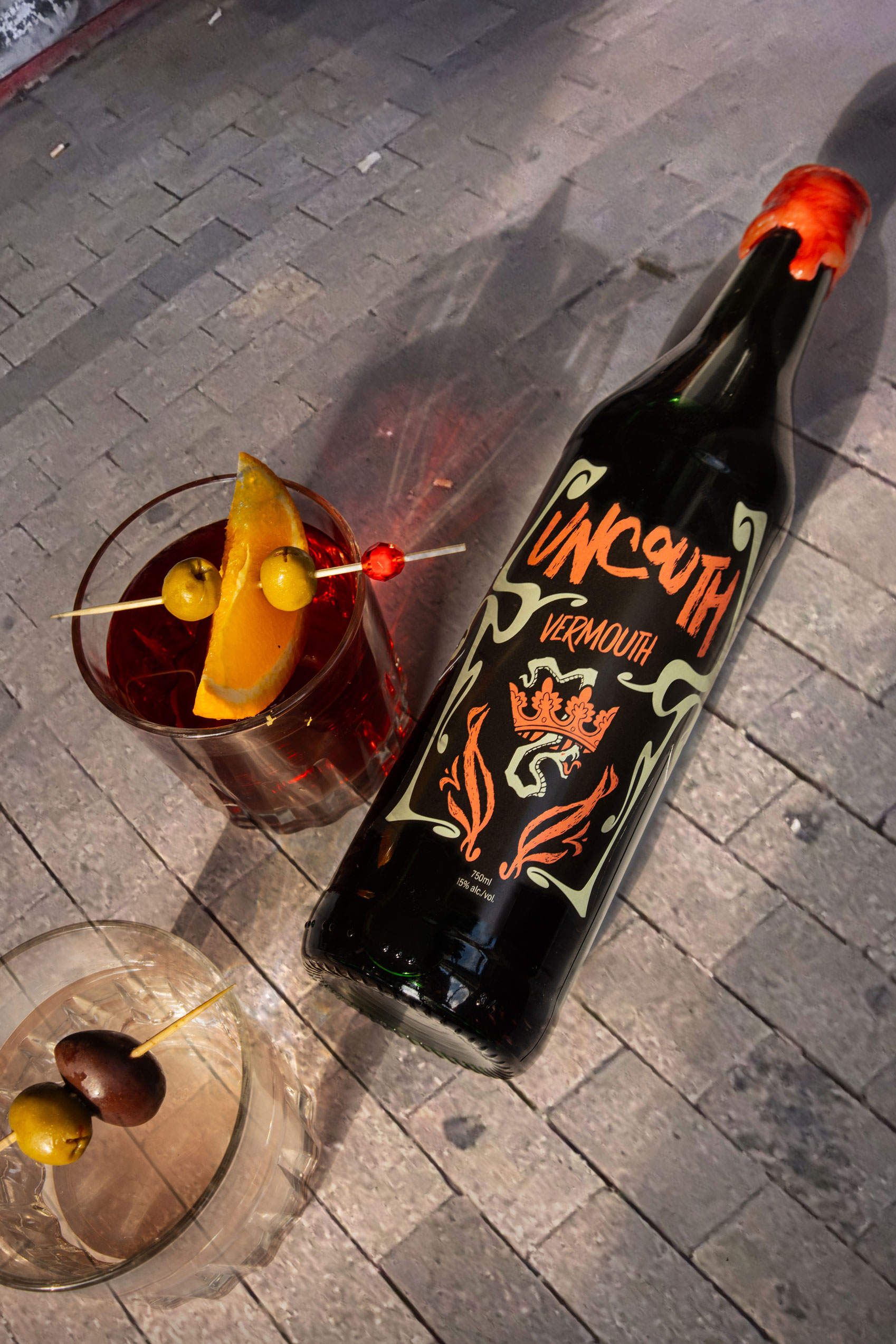
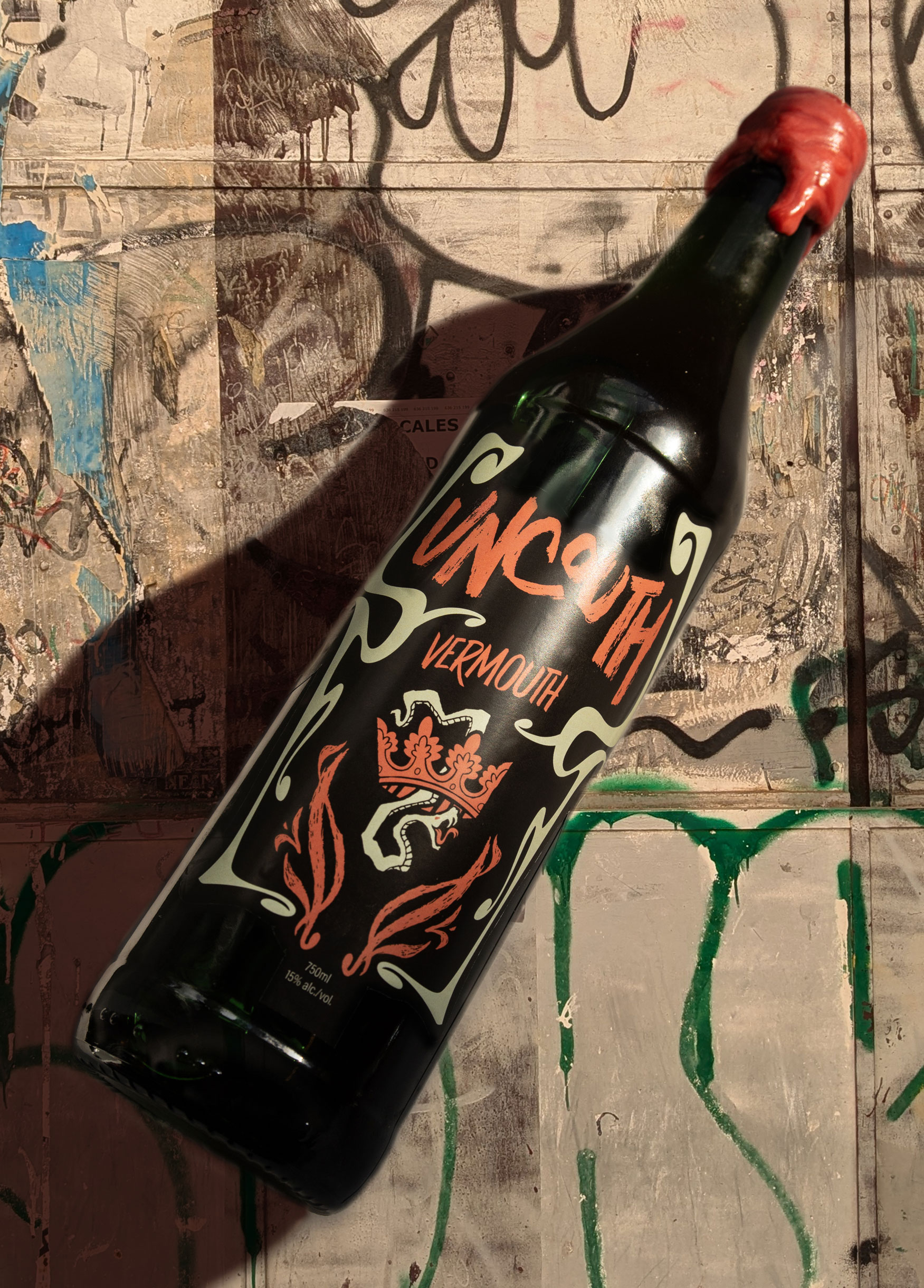
Creative Direction, Art Direction, Designer + Illustrator, Photographer: Rodolfo Claros Berlioz
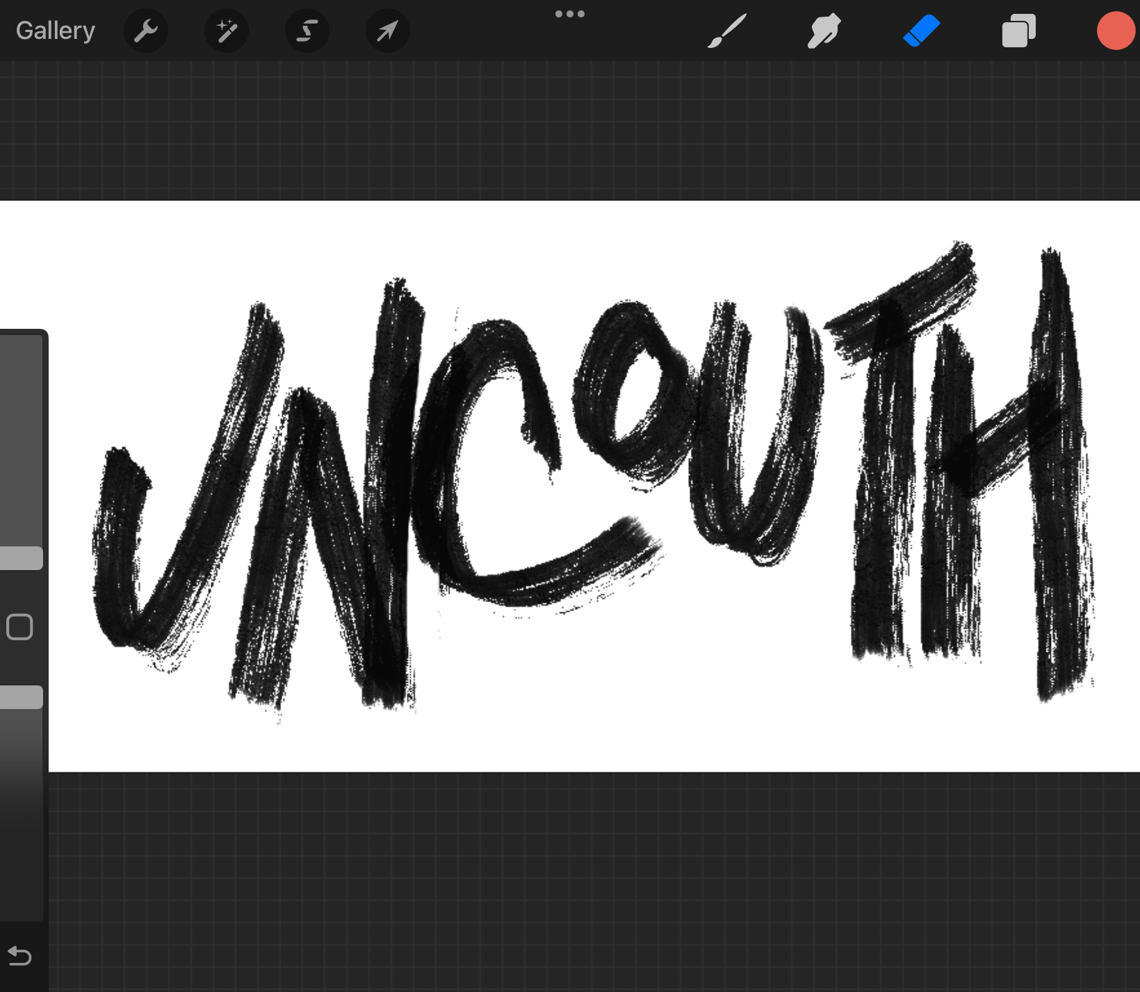
At first, I thought I could piggyback off of a display font trend. Then I tried sketching a Modernist-like logotype, as a nod to Gaudi and the other Modernists. But I realized I was falling into that passive cycle that lacks a backbone. A cycle that focuses more on bragging about some intellectual reference and praising the past.
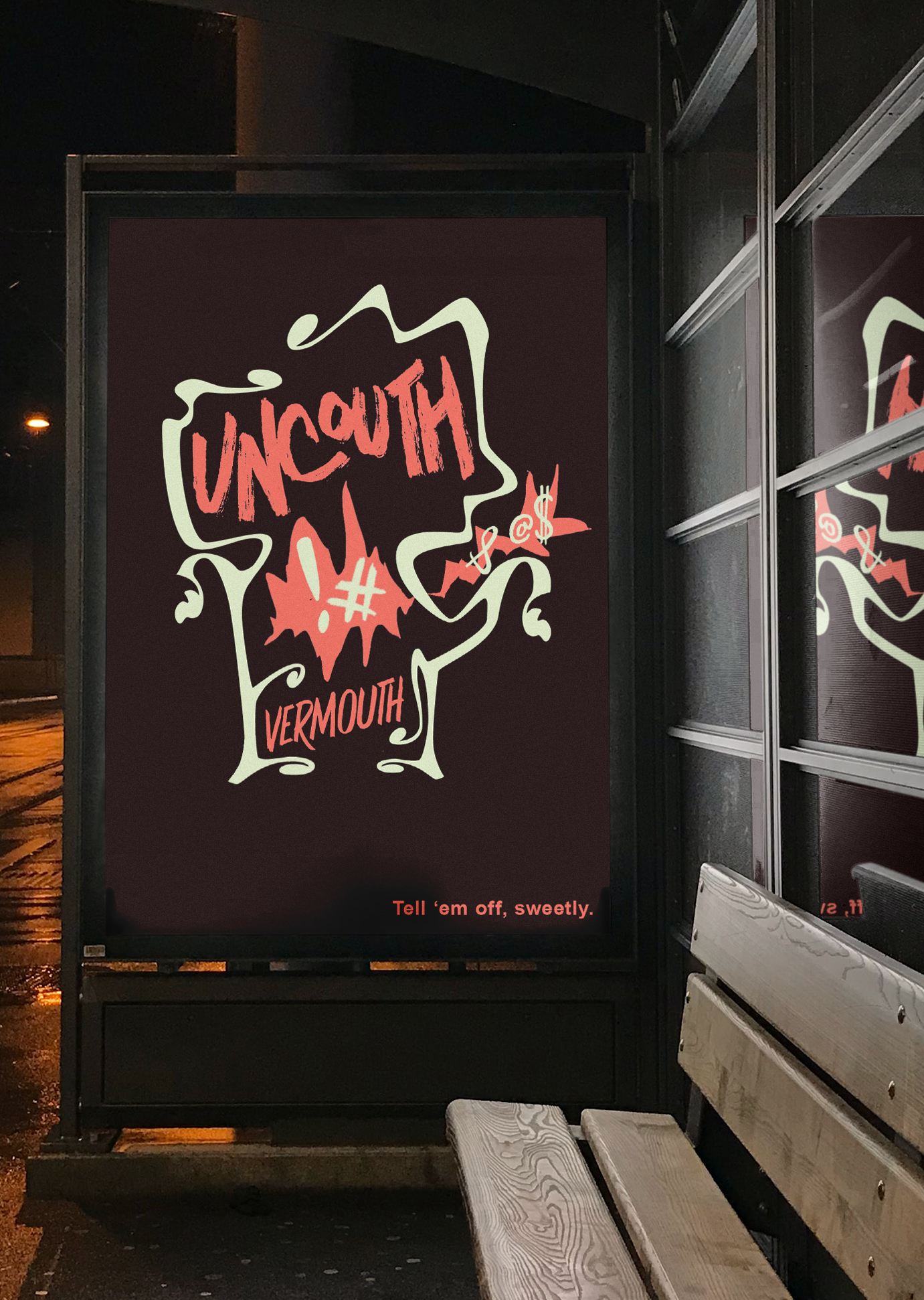
So I focused on the name of the project. I picked up a brush and I left a mark.

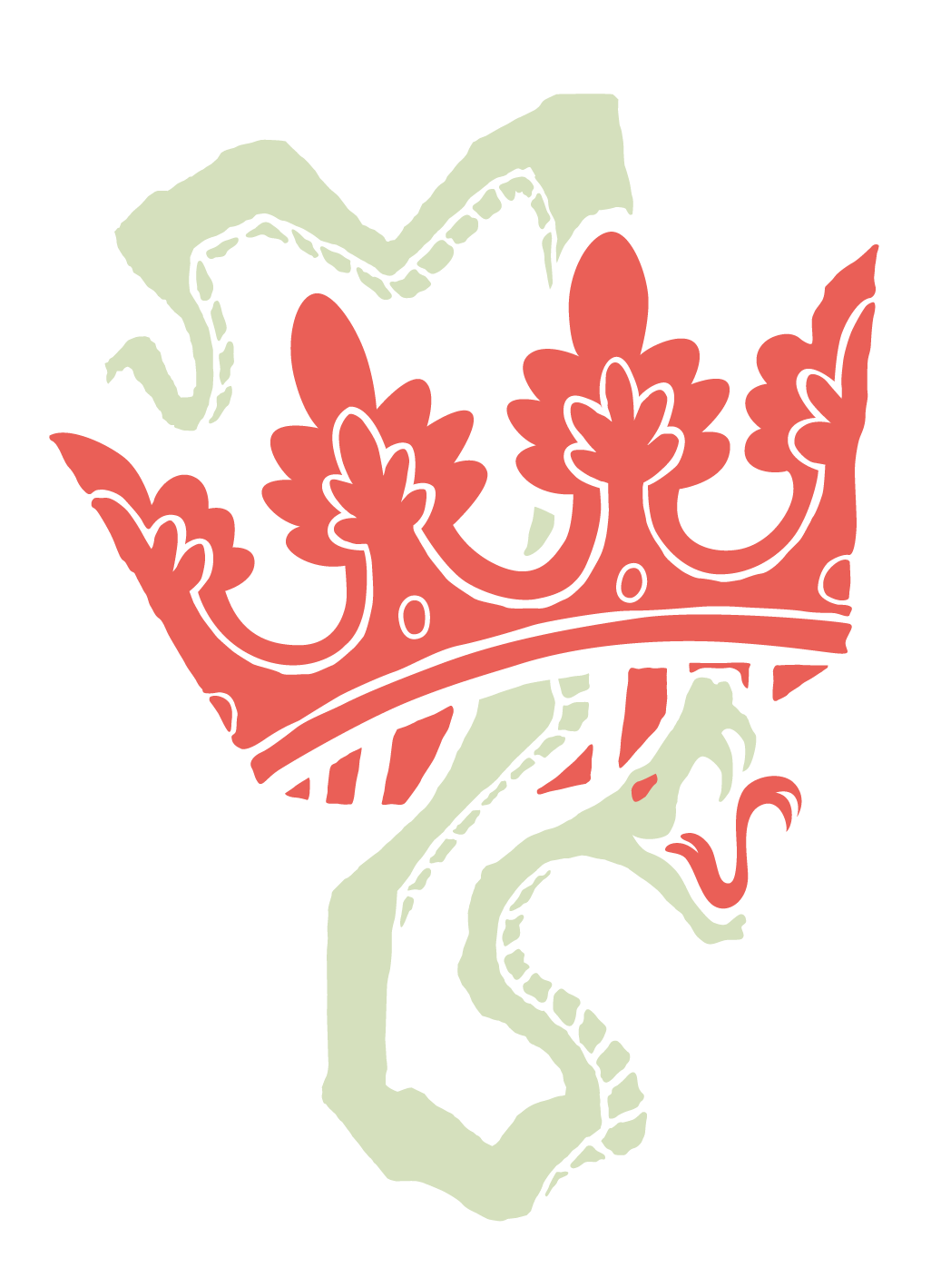
A nod to the rebels.
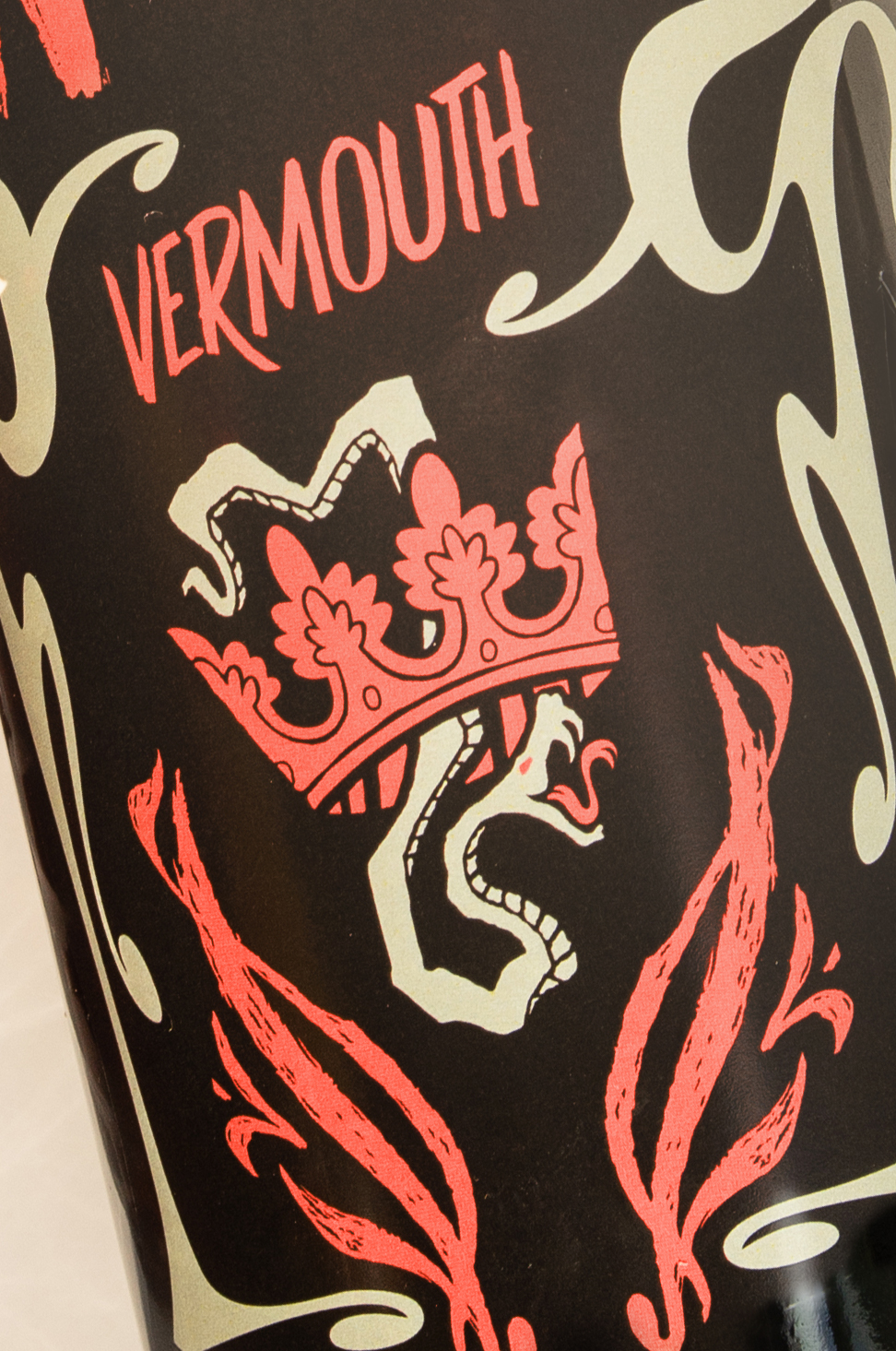
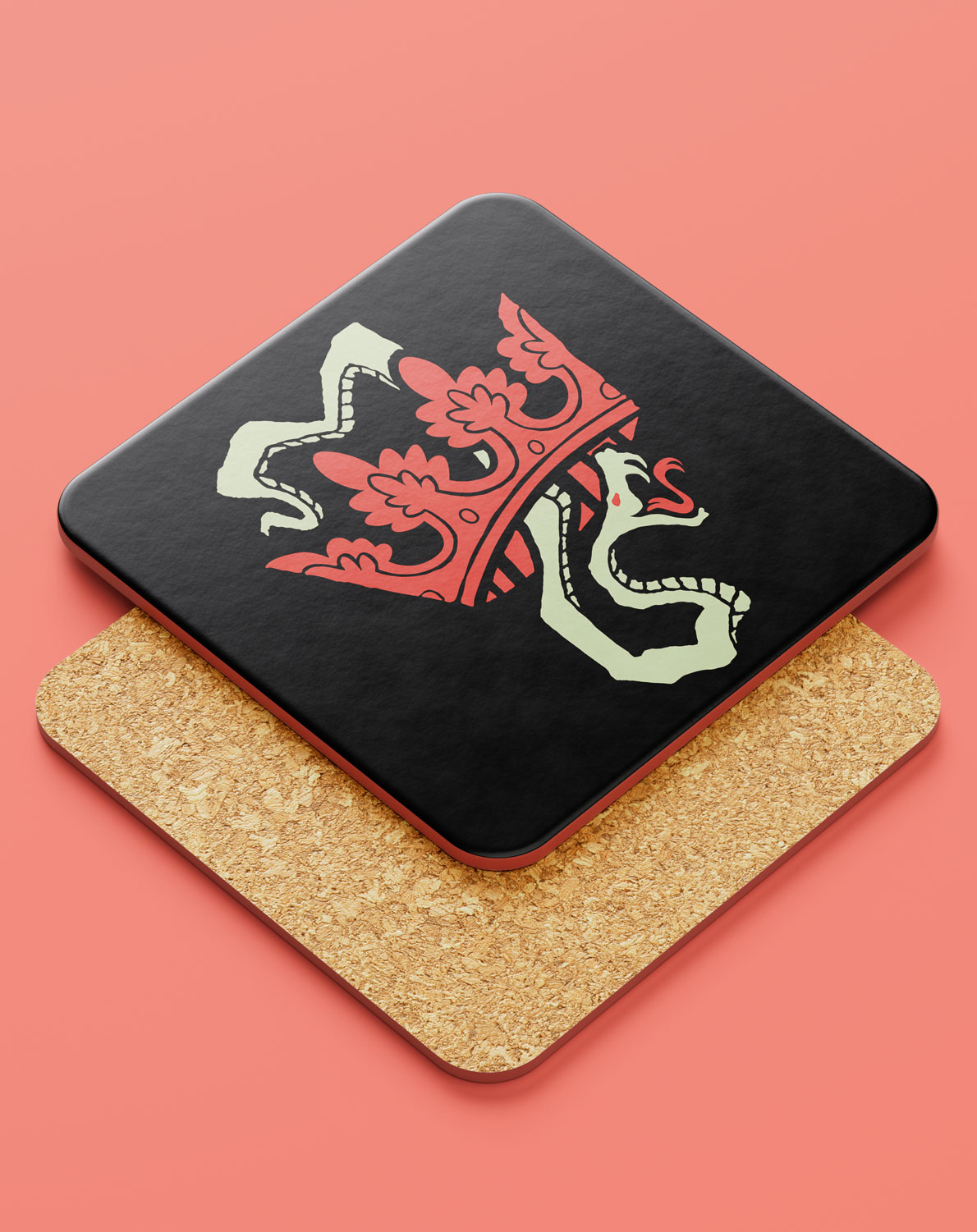
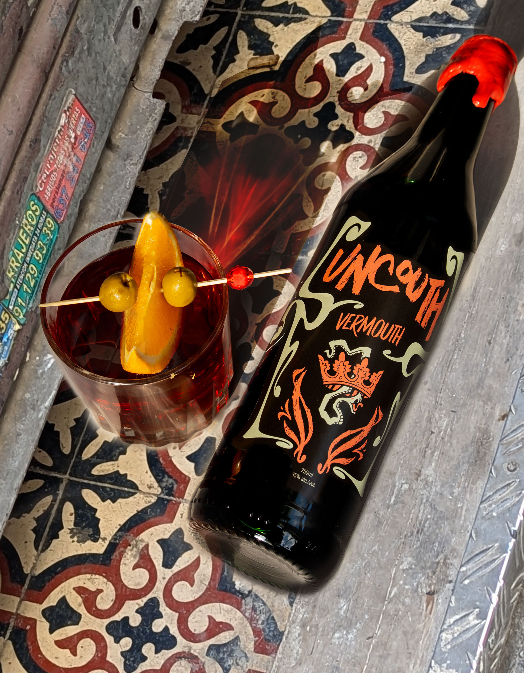
It's only after visiting Catalunya that I understand their struggle for independence. It is a land of honest people. Where hard work is not clowned up with bows and baroque coils. As a nod to their constant efforts I've added the cunning snake who slithers through and past a lack-luster crown.
Adorned and adored by Modernismo
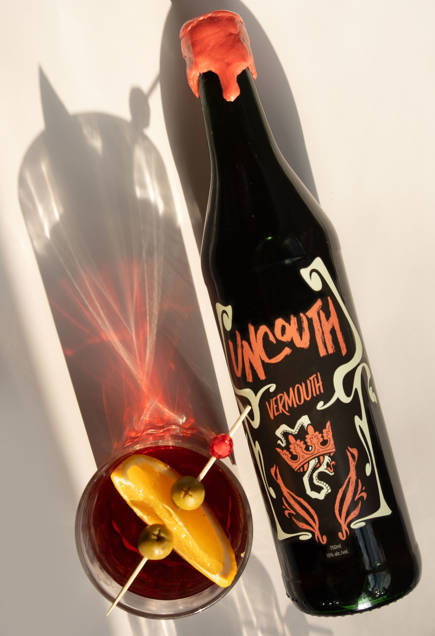
Like a tour guide who's never off the clock, Modernismo accompanies you around every corner of Barcelona. It stretches and curls, dips, and slithers; making the city it's playground but at the same time wrapping all the beauty that it breathes out.
Framing the volatile logotype with these organic lines manifests an understanding and a harmony where the visually stunning and the coarse and wild can coexist.
