Lighthouse Labs
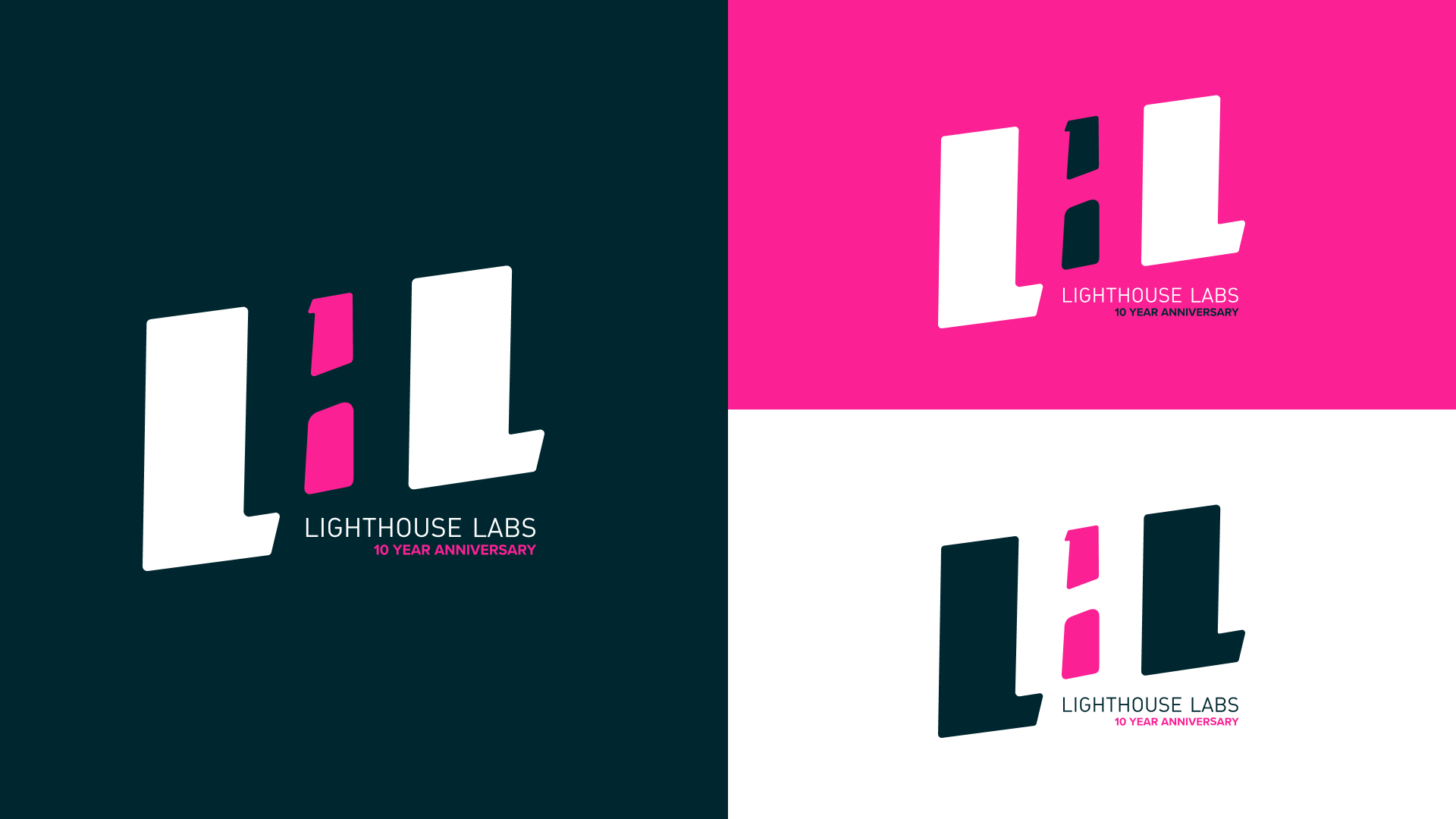
10 Year Anniversary logo
Lighthouse Labs is a leading tech education company that empowers individuals to transform their lives through hard work and dedication.
For its 10-Year Anniversary, we decided to shake things up a bit.
Creative Direction: Gabrielle Béland
Art Direction: Rodolfo Claros Berlioz
Designer: Rodolfo Claros Berlioz
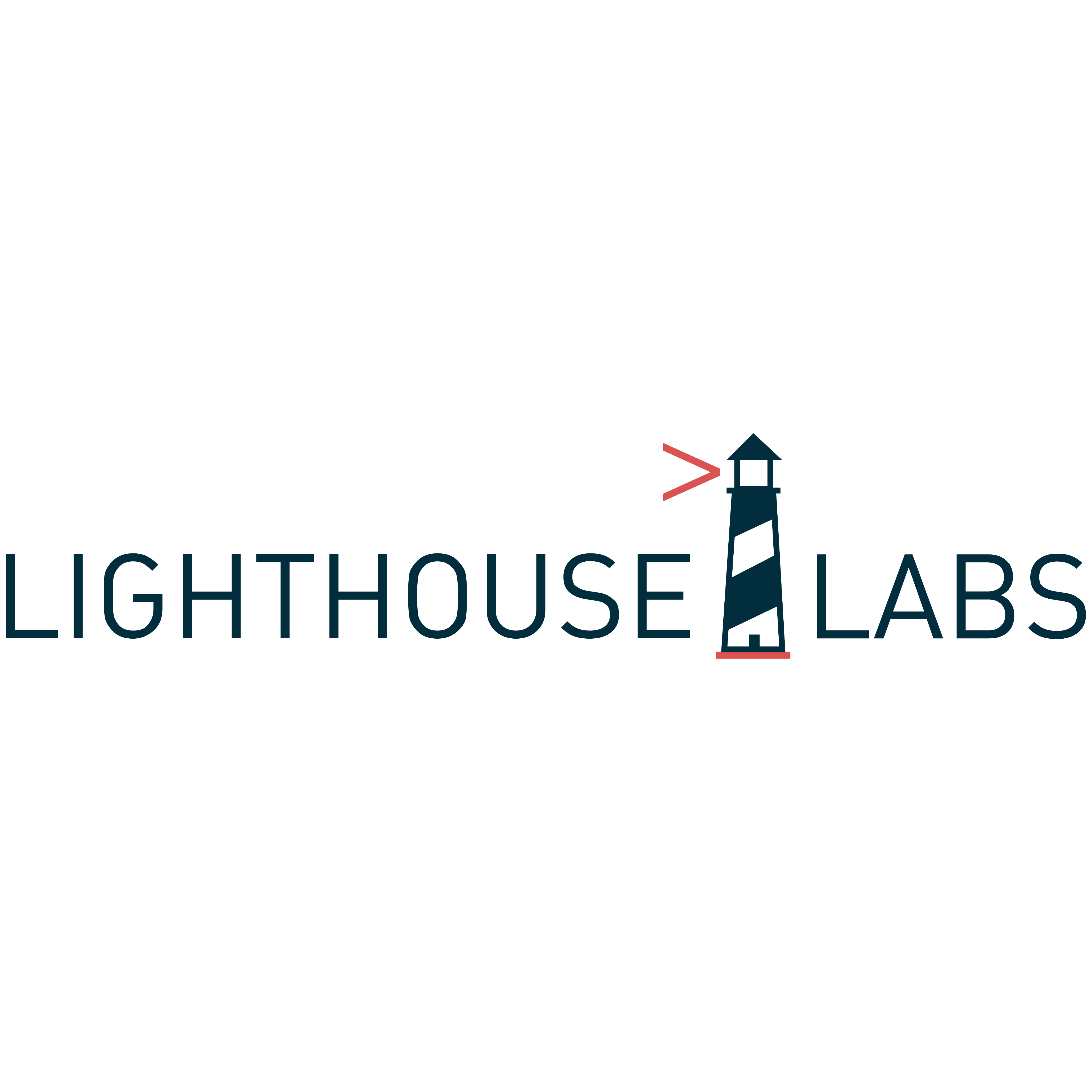
Original logo
Besides the noticeable pain points like a thin typographical weight and restrictive width; this typographical logo is not properly kerned and the lighthouse imagery is an asset that is awkwardly as a divider


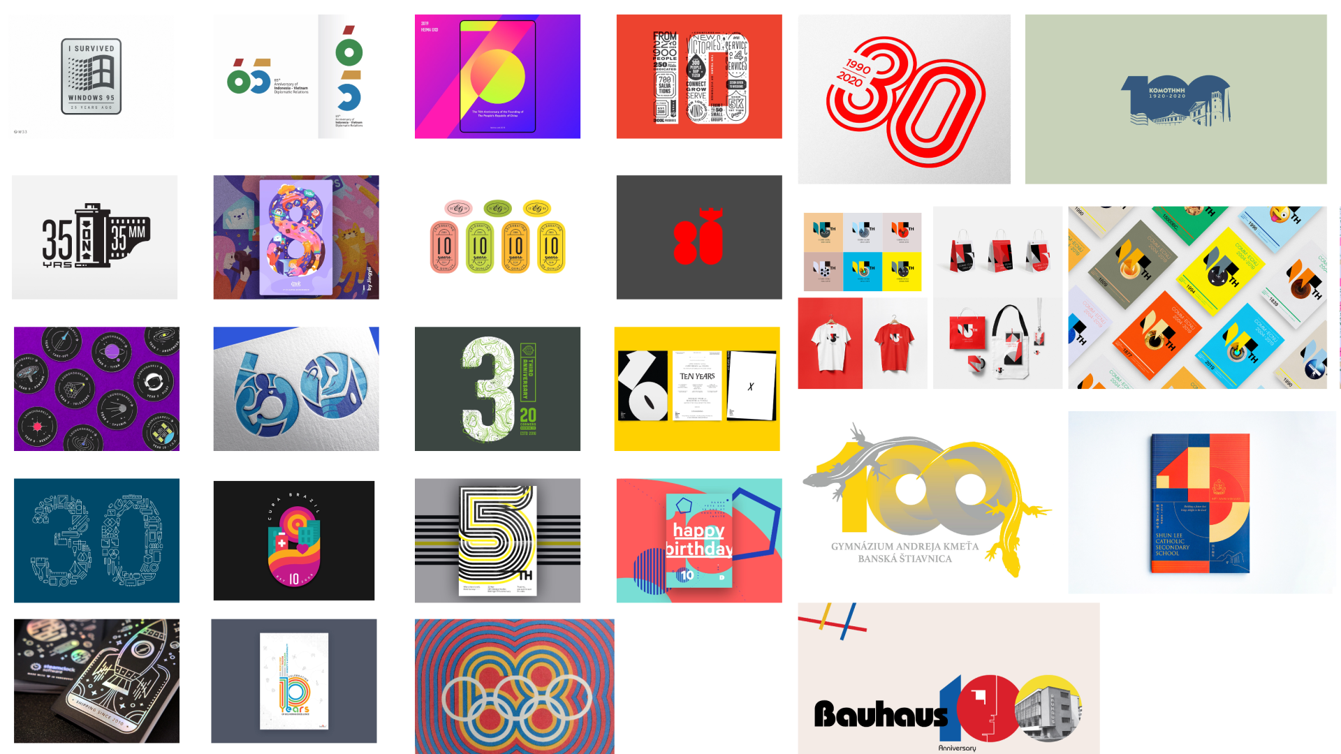
Moodboard
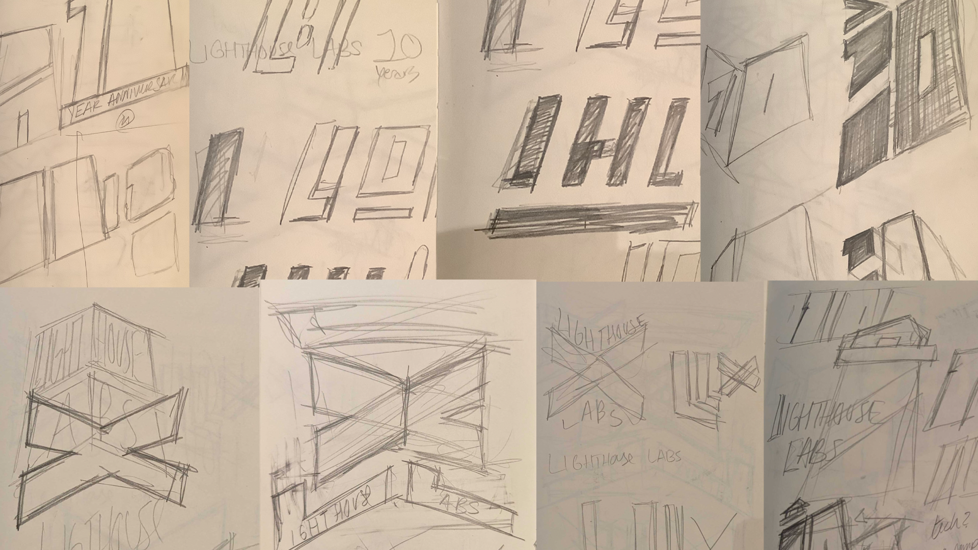
Thumbnail
sketches

The Breakdown
LHL. That's how we refer to the company in countless Slack messages and casual interactions. For our 10-Year Anniversary, we wanted to make something that connected our Alumni and the many people who worked on getting this company to this milestone. Paired with my fascination with logos that hold "secrets" (FedEx, Toblerone, Tour De France) I took a page from the good ol' Gestalt teachings and picked negative space as a starting point.
Celebrating the 10 Years was important, but I also wanted to correct some of the weak points we have in our institutional logo. A compact badge-like logo would check as many boxes as possible. Easy to spot out. Works well on responsive websites. And works looks great in every printed merch article.
